 This is the first in a series of posts I expect to write to help me think through the use of network analysis and visualization.
When I started converting the printed American Labor Who’s Who to an electronic database, I knew the data would be a handy reference tool for students. But I also hoped to use the data for my own research, and that it might even be instructive for contemporary activists. In particular, I figured the directory of labor and radical leaders might help us see the interconnections between organizations and people that make up the thing we call “the labor movement,” and the fact that the movement was broader than “trade unionism” alone.
Why does that matter? Well, if we consider that union membership is currently below 10% of the private sector workforce, things seem pretty hopeless for Labor. How can a social group as defensive and marginal as that ever hope to assert real power again? But if we think of the unions as part of a broader political and social grouping that also includes journalists, educators, activists and lawyers–then we have something much larger and broader. That’s important not just for politics today, but for the way we think about historical change. As a number of labor scholars have noted, the labor movement tends to grow in sudden, massive upsurges rather than by slow steady accretion. The question is, what enables these upsurges?
For much of the 1920s and 1930s, union density was low and employers had the upper hand. Unions and radicals were divided against each other. A lot of energy went into expelling dissidents and poaching members from other organizations. Old forms of unionism held on to authority, while newer forms remained inchoate or marginalized. But unionism and progressive/radical political activism held on and, in the late 1930s and 1940s grew exponentially. Legal and macro-political changes had a lot to do with that upsurge–especially a new federal policy in favor of collective bargaining and the full employment context of World War II. But the massive and swift growth in union membership and power was also based on a network of local militants who carried out the organizing drives, produced labor newspapers and radio shows, and staffed the strike kitchens and community support networks that sustained activism.
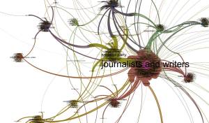
So consider this chart, based on the index of the American Labor Who’s Who, which lists individuals by category (e.g., AFL affiliated, independent unions, miscellaneous), and by organization or subcategory (e.g., United Mine Workers or Journalists & Writers). Note: elsewhere, I’ve explained the limits of this source in terms of representativeness, and why it’s still worth using. This analysis is based on the roughly 1,300 U.S. entries.

I extracted the text of the index from the ePub version of the Who’s Who on the HathiTrust Digital Library, and converted it into a spreadsheet in Microsof Excel. Using the Table 2 Net website I converted a CSV formatted version of the spreadsheet it into a bipartite network table. Then I opened that table in Gephi–a free network analysis and visualization program and created a chart with the Force Atlas algorithm.
In a network you have “nodes” and “edges.” This is a “bipartite” network, meaning there are two kinds of nodes: people and categories of organization/activity. The edges are the connections between the two types of nodes. This is a “directed” network, which means that the lines of connection (the edges) only flow in one way: individuals are members of organizations, subcategories, and categories of organizations.
The chart orients around two poles of about equal size: American Federation of Labor (AFL)-affiliated bodies and everyone else (including journalists, independent unions, and political parties among others). Depending on your mood you could read this as affirming the AFL as the dominant player in this social field, or as suggesting the diversity of and balance of players. Or you might suggest there was some level of tension and conflict between the two poles. It’s useful to remember that this chart is an analytical tool, not necessarily a direct representation of reality–and there are layers of “bias” baked into the data from its origins.
This chart is designed to accentuate the separation of the groups for analytical purposes. It doesn’t show the edges (connections between and among people and organizations), only the relative groupings. I’ll get into the linkages between groups in subsequent posts. In particular, I’m interested in the group of green dots that sits between the AFL and Miscellaneous poles. This turns out to be made up of editors of major union and labor federation newspapers. They were a key group that linked unions to the broader working-class public sphere in large part because they formed bridges between unions and other social sectors–something that seems to be represented here in the chart.