Situations and Relations

Back in February, I gave a talk to the UCLA Digital Labor Working Group about my network analysis with the Labor Who’s Who data. You can see my slides here.

Patterns within a welter of information. Red dots represent people, light green dots represent organizations.

I opened with the idea that “the labor movement” is an abstraction–a place-holder phrase that means different things at different times. The American Labor Who’s Who was a particular version of that abstraction, created at a particularly contentious moment in labor history. It was compiled by a team led by Solon De Leon (son of a famous radical polemicist), and published by the Socialist Party aligned Rand School of Social Science. It describes a labor movement that encompasses not only trade unions, but also radical political movements, immigrant organizations, researchers, journalists, and what we would call “NGOs” today. My analysis, drawn from data extracted from the Who’s Who, is an abstraction of an abstraction.

It’s worth beginning with this caveat because computation and data visualization have an aura of legitimacy these days. These network charts (created in Gephi) are representations of reality, not reality itself. They are best used as models of plausible past realities, tools for thinking through problems of historical argument, rather than as illustrations per se.

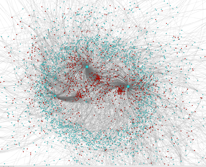
I began with the broadest and busiest view of the data: all the people in the Who’s Who and organizations they belonged to (slide 1). The mathematical model that creates this chart draws more connected elements, or “nodes,” closer to the center and pushes less connected elements to the edges. A node’s size depends on how connected it is to other nodes, and lines connect people to the organizations they belong to. In these charts, the lines, or edges, have direction. People belong to organizations, so radiate from each person to their corresponding organizations.

In broad strokes, the first graph presents a ring of organizations roughly the same size, three organizations that are noticeably larger on the inside edge of the ring, and several groupings of people inside the ring. Without knowing the names of the people or the organizations, it appears that three or four organizations dominate the institutional field of the labor movement. There is also a lot of “noise.”

The right wing constellation of organizations included the AFL, fraternal societies, and the Democratic and Republican parties.
The left-wing constellation of organizations centered on the Socialist Party.

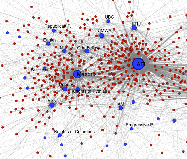
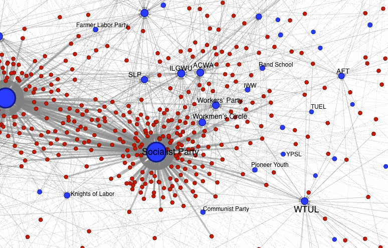
The next two slides try to filter out some of that noise by focusing on the “right” and “left” flanks of this social formation (think of it as “stage right”). The American Federation of Labor (AFL) and the Masons dominate the right side of the field (slide 2), surrounded by other fraternal organizations (Elks, Odd Fellows, Moose, etc.), mainstream political parties, and four trade unions–the Printers (ITU), Machinists (IAM), Miners (UMWA), and Carpenters (UBC). On the left (slide 3), the Socialist Party dominates, and is surrounded by independent unions (two garment worker unions and the IWW), left-wing parties and para-party organizations (Communist and Workers parties, the Trade Union Educational League, left-wing youth organizations, and the Workmen’s Circle. Worth noting: the spatial position of a node has no relationship to its place on the left/right political spectrum. The Women’s Trade Union League and the American Federation of Teachers, for instance, are farther away from the SP than the Workers’ Party, for instance. (In future I should probably reorient these vertically!)

Henry Ohl was a leading figure in the Wisconsin labor movement, and the Univ. of Wisconsin School for Workers.

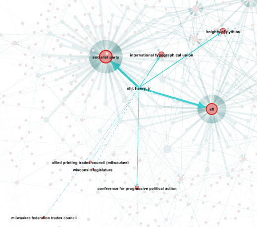
Next come two slides that focus on two individuals who show up near the center of the graph, and represent mediating figures between the AFL and SP-oriented flanks of the movement. Henry Ohl, Jr. (slide 4) was a Milwaukee Socialist and a printer who championed the University of Wisconsin’s School for Workers.

Socialist editor Max Hayes was unusually well connected to the key organizations of the 1920s labor movement.

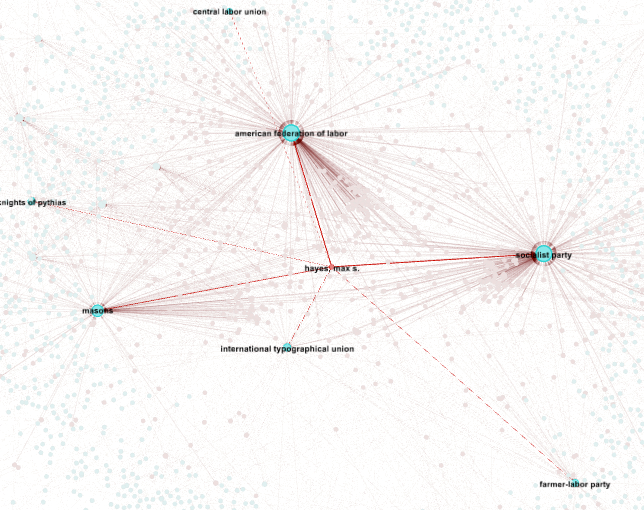
Max Hayes (slide 5) was a Cleveland Socialist–another printer–and the editor of the Cleveland Citizen. Both men started working in their early teens, apprenticed as printers, and were deeply involved in Socialist politics. Compare these two men with William Z. Foster (slide 6). He also linked the AFL and the SP, but by 1925 was publicly associated with the Workers’ Party and is placed farther on the periphery of the graph. Similarly, women union activists sit on the periphery of these network graphs, as do a number of labor intellectuals.

Whether Foster (or Pauline Newman or A. Philip Randolph) was less “central” to the labor movement of 1925 than Ohl or Hayes  is not really what the graph explains. Centrality in this model is not the same as “importance.” Ohl and Hayes are more “central” because they were members of fraternal associations, and their membership creates a relationship in this model that draws them closer to the many non-Socialist men who were likewise part of the world of the Masons, Odd Fellows, Elks, and Moose.

Communist leader William Z. Foster's network profile.
Communist leader William Z. Foster’s network profile.

Unfortunately, we can’t see how this chart would change by 1940 when new leaders and organizations were in the field, and some of those on the periphery in 1925 moved to the center (e.g., Sidney Hillman). But the lack of chronology also helps us see the way careers in the labor movement spanned multiple institutions (e.g., Max Hayes in the Peoples Party and the SP).

Labor and radical history is often told one organization at a time, one city at a time, one campaign at a time. Of course we use the singular focus as a way to get at broader themes. When I researched my first book, I began with IWW harvest workers, and that opened out onto a whole constellation of social forces, places, and people. Network graphs, for all their complications and limitations, turn our eyes first to the relatedness that structures a social field. The “labor movement” of the 1920s was a particularly contentious place where splits between one wing or the other severed ties between erstwhile comrades. But groups and individuals in contentious relationships are still in relationships. A labor movement divided and fighting was still a movement to overturn the worst abuses of capitalism.

An insight I’ve gained from my research on workers’ education in between the world wars is that organizational schisms were not always the end of the story. Quite often they produced more talk, more action, and more learning. “There is no one road to freedom,” said the author of a popular workers’ education pamphlet, “There are roads to freedom.”

**************************

Note: I know the charts mix up colors and orientations. Extracting good charts from Gephi is one of the big challenges of this project, and I’m working on some other–also imperfect–ways to share the visualizations in more active form.

Networked Labor Movement: Edges and Mediators

This is the third in a series of posts I am writing to help me think through the use of network analysis and visualization.

A more attractive, but somewhat less informational, version of the chart showing the mediators grouped into their own node. Note that the node is green because it is made up of individuals.

My first post in this series off-handedly introduced the phrase “bipolar labor movement”–which I suppose is a nice way to avoid calling it schizophrenic. Then I took a sideways step to flesh out contents of the major categories in the American Labor Who’s Who index. Now we can move on to the look at the connections between all those dots that make the cool-looking network charts (right).

In network analysis lingo these links between people, organizations, and groups of organizations are called “edges.” In this post I’m going to look at a number of different layouts, some of which will be prettier than others. This is partly a function of Gephi, which has two ways of viewing the charts: Overview (not as pretty but more analytically functional) and Preview (less analysis and more graphic beauty).

A network chart based on the index of the American Labor Who's Who (1925). Blue dots represent major categories, red dots are organizations or subcategories, and green dots represent individuals.
A network chart based on the index of the American Labor Who’s Who (1925). Blue dots represent major categories, red dots are organizations or subcategories, and green dots represent individuals.

If you recall from the first post in the series, I came up with something that looks like a scatter plot (left). Green dots represent individuals, red dots represent subcategories of the index, and blue dots represent top-level categories. Below, I’ve used the same image, but made the edges visible.

One of the problems here is that there are so many nodes and links tightly packed that it gets very hard to make sense of them in the aggregate–the main reason I began with a simplified and abstracted version in the first post. In Gephi, you can filter out the less networked nodes (say, anyone who isn’t in at least two categories/groups). But for the moment it’s interesting just to ponder the whole messy lot and look for possible patterns.

Network chart showing edges (linkages) based on index of the American Labor Who’s Who (1925) with major groups labeled.

The clearest bits of new information are that there are a number links, and a group of individuals (green dots) in between the major (blue) nodes This seems potentially important. The individuals in the middle appear to be the bridge that links an otherwise polarized social formation. Did they really have such a function in historical context, or is their position on the chart an artifact of the program parameters that create the chart in the first place?

By selecting this group of nodes in Gephi we can see what they link to: mainly the AFL, Misc. Groups, Journalists and Writers, Political Parties, the Socialist Party, and Workers’ Education. So far so good. These are all likely places to find people who served as liaisons between unions and what today we would call NGOs. Let’s call these people “mediators” because they sit in the middle of, and link, the AFL and everyone else.

The group of roughly 50 individuals who appear between the major nodes have been selected. The bright green lines point to groups/categories they belong to, and the names of those groups are visible.  Non-connected nodes are faded in background.  Chart produced in Gephi.
The group of roughly 50 individuals who appear between the major nodes have been selected. The bright green lines point to groups/categories they belong to, and the names of those groups are visible. Non-connected nodes are faded in background. Chart produced in Gephi.

Now, for the sake of simplifying the chart, we’ll group the “mediators” into their own node (Below: the green dot in between the two big blue circles. I’ve also rotated the chart to get a closer view). To do this in Gephi, you right-click on the highlighted group and choose “Group” from the menu. With the same mouse command you can tell Gephi to highlight the group in the “Data Laboratory” (i.e., the interface for looking at the underlying tables that make up the charts). In the image below, the “mediators” group and all the nodes it connects to are selected/highlighted. Everything else (non-linked nodes) is faded out. See all the white dots in the green field surrounding the AFL node? Those are non-selected individuals. So this chart represents a sub-network of the broader dataset: the mediators (a group of individuals–green circle) and all the organizations (red) and categories of organizations (blue) they belong to.

The "mediators" have been grouped into a single node and selected.  Organizations or categories linked to this group of individuals are visible while non-connected orgs are faded in the background. Network chart created in Gephi.
The “mediators” have been grouped into a single node and selected. Organizations or categories linked to this group of individuals are visible while non-connected orgs are faded in the background. Network chart created in Gephi.

The next step is the figure out who these individuals are. Turns out I’ve selected 54 individuals in all. Among the more well-known are Fannia Cohn (IWGWU, workers’ education), Max Hayes (editor of the Cleveland Citizen and prominent Socialist), Arturo Giovanitti (ILGWU, formerly IWW), Mathew Woll and John Frey (AFL arch-conservatives), Alice Henry (WTUL), Fred Hewitt (editor of Machinists Monthly Journal), and a number of other labor union newspaper editors. I’ll have to spend a little time running through this list to make solid conclusions, but it makes sense that there are so many editors and writers.

But I’m running out of steam and will have to leave that for another day. I will leave you with this much nicer version of the same chart. I’m not sure what it means, but it really looks like a peacock!

A more attractive, but somewhat less informational, version of the chart showing the mediators grouped into their own node. Note that the node is green because it is made up of individuals.

The Networked Labor Movement

index-labelsThis is the first in a series of posts I expect to write to help me think through the use of network analysis and visualization.

When I started converting the printed American Labor Who’s Who to an electronic database, I knew the data would be a handy reference tool for students. But I also hoped to use the data for my own research, and that it might even be instructive for contemporary activists. In particular, I figured the directory of labor and radical leaders might help us see the interconnections between organizations and people that make up the thing we call “the labor movement,” and the fact that the movement was broader than “trade unionism” alone.

Why does that matter? Well, if we consider that union membership is currently below 10% of the private sector workforce, things seem pretty hopeless for Labor. How can a social group as defensive and marginal as that ever hope to assert real power again? But if we think of the unions as part of a broader political and social grouping that also includes journalists, educators, activists and lawyers–then we have something much larger and broader. That’s important not just for politics today, but for the way we think about historical change. As a number of labor scholars have noted, the labor movement tends to grow in sudden, massive upsurges rather than by slow steady accretion. The question is, what enables these upsurges?

For much of the 1920s and 1930s, union density was low and employers had the upper hand. Unions and radicals were divided against each other. A lot of energy went into expelling dissidents and poaching members from other organizations. Old forms of unionism held on to authority, while newer forms remained inchoate or marginalized. But unionism and progressive/radical political activism held on and, in the late 1930s and 1940s grew exponentially. Legal and macro-political changes had a lot to do with that upsurge–especially a new federal policy in favor of collective bargaining and the full employment context of World War II. But the massive and swift growth in union membership and power was also based on a network of local militants who carried out the organizing drives, produced labor newspapers and radio shows, and staffed the strike kitchens and community support networks that sustained activism.

So consider this chart, based on the index of the American Labor Who’s Who, which lists individuals by category (e.g., AFL affiliated, independent unions, miscellaneous), and by organization or subcategory (e.g., United Mine Workers or Journalists & Writers). Note: elsewhere, I’ve explained the limits of this source in terms of representativeness, and why it’s still worth using. This analysis is based on the roughly 1,300 U.S. entries.

A network chart based on the index of the American Labor Who's Who (1925). Blue dots represent major categories, red dots are organizations or subcategories, and green dots represent individuals.
A network chart based on the index of the American Labor Who’s Who (1925). Blue dots represent major categories, red dots are organizations or subcategories, and green dots represent individuals.

I extracted the text of the index from the ePub version of the Who’s Who on the HathiTrust Digital Library, and converted it into a spreadsheet in Microsof Excel. Using the Table 2 Net website I converted a CSV formatted version of the spreadsheet it into a bipartite network table. Then I opened that table in Gephi–a free network analysis and visualization program and created a chart with the Force Atlas algorithm.

In a network you have “nodes” and “edges.” This is a “bipartite” network, meaning there are two kinds of nodes: people and categories of organization/activity. The edges are the connections between the two types of nodes. This is a “directed” network, which means that the lines of connection (the edges) only flow in one way: individuals are members of organizations, subcategories, and categories of organizations.

The chart orients around two poles of about equal size: American Federation of Labor (AFL)-affiliated bodies and everyone else (including journalists, independent unions, and political parties among others). Depending on your mood you could read this as affirming the AFL as the dominant player in this social field, or as suggesting the diversity of and balance of players. Or you might suggest there was some level of tension and conflict between the two poles. It’s useful to remember that this chart is an analytical tool, not necessarily a direct representation of reality–and there are layers of “bias” baked into the data from its origins.

This chart is designed to accentuate the separation of the groups for analytical purposes. It doesn’t show the edges (connections between and among people and organizations), only the relative groupings. I’ll get into the linkages between groups in subsequent posts. In particular, I’m interested in the group of green dots that sits between the AFL and Miscellaneous poles. This turns out to be made up of editors of major union and labor federation newspapers. They were a key group that linked unions to the broader working-class public sphere in large part because they formed bridges between unions and other social sectors–something that seems to be represented here in the chart.