This is the third in a series of posts I am writing to help me think through the use of network analysis and visualization.

My first post in this series off-handedly introduced the phrase “bipolar labor movement”–which I suppose is a nice way to avoid calling it schizophrenic. Then I took a sideways step to flesh out contents of the major categories in the American Labor Who’s Who index. Now we can move on to the look at the connections between all those dots that make the cool-looking network charts (right).
In network analysis lingo these links between people, organizations, and groups of organizations are called “edges.” In this post I’m going to look at a number of different layouts, some of which will be prettier than others. This is partly a function of Gephi, which has two ways of viewing the charts: Overview (not as pretty but more analytically functional) and Preview (less analysis and more graphic beauty).

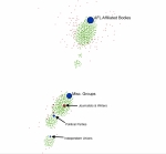
If you recall from the first post in the series, I came up with something that looks like a scatter plot (left). Green dots represent individuals, red dots represent subcategories of the index, and blue dots represent top-level categories. Below, I’ve used the same image, but made the edges visible.
One of the problems here is that there are so many nodes and links tightly packed that it gets very hard to make sense of them in the aggregate–the main reason I began with a simplified and abstracted version in the first post. In Gephi, you can filter out the less networked nodes (say, anyone who isn’t in at least two categories/groups). But for the moment it’s interesting just to ponder the whole messy lot and look for possible patterns.

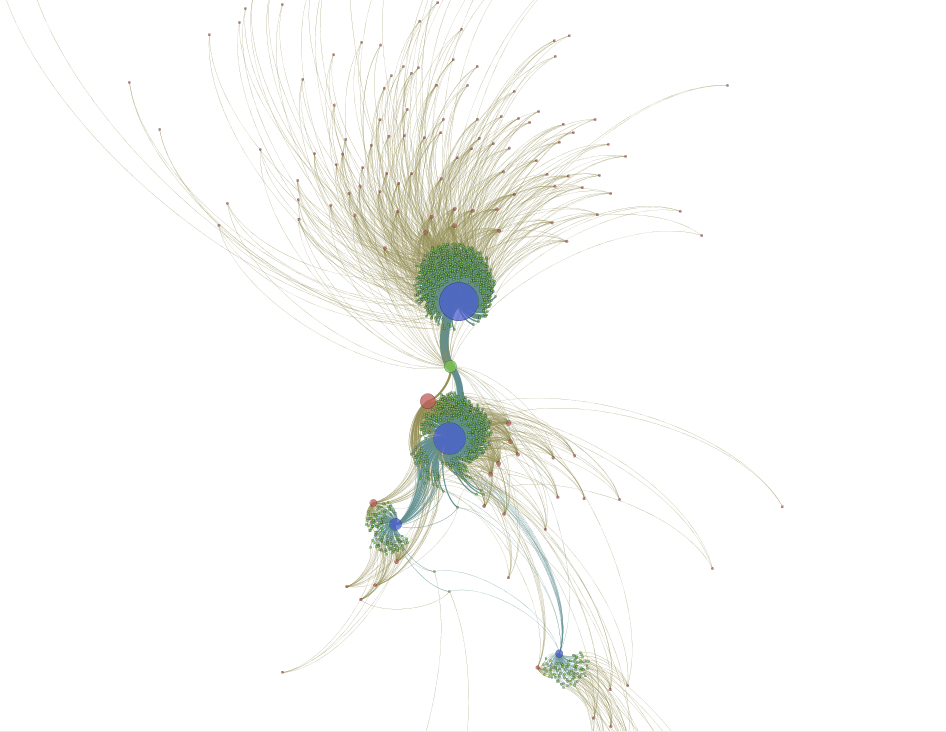
The clearest bits of new information are that there are a number links, and a group of individuals (green dots) in between the major (blue) nodes This seems potentially important. The individuals in the middle appear to be the bridge that links an otherwise polarized social formation. Did they really have such a function in historical context, or is their position on the chart an artifact of the program parameters that create the chart in the first place?
By selecting this group of nodes in Gephi we can see what they link to: mainly the AFL, Misc. Groups, Journalists and Writers, Political Parties, the Socialist Party, and Workers’ Education. So far so good. These are all likely places to find people who served as liaisons between unions and what today we would call NGOs. Let’s call these people “mediators” because they sit in the middle of, and link, the AFL and everyone else.

Now, for the sake of simplifying the chart, we’ll group the “mediators” into their own node (Below: the green dot in between the two big blue circles. I’ve also rotated the chart to get a closer view). To do this in Gephi, you right-click on the highlighted group and choose “Group” from the menu. With the same mouse command you can tell Gephi to highlight the group in the “Data Laboratory” (i.e., the interface for looking at the underlying tables that make up the charts). In the image below, the “mediators” group and all the nodes it connects to are selected/highlighted. Everything else (non-linked nodes) is faded out. See all the white dots in the green field surrounding the AFL node? Those are non-selected individuals. So this chart represents a sub-network of the broader dataset: the mediators (a group of individuals–green circle) and all the organizations (red) and categories of organizations (blue) they belong to.

The next step is the figure out who these individuals are. Turns out I’ve selected 54 individuals in all. Among the more well-known are Fannia Cohn (IWGWU, workers’ education), Max Hayes (editor of the Cleveland Citizen and prominent Socialist), Arturo Giovanitti (ILGWU, formerly IWW), Mathew Woll and John Frey (AFL arch-conservatives), Alice Henry (WTUL), Fred Hewitt (editor of Machinists Monthly Journal), and a number of other labor union newspaper editors. I’ll have to spend a little time running through this list to make solid conclusions, but it makes sense that there are so many editors and writers.
But I’m running out of steam and will have to leave that for another day. I will leave you with this much nicer version of the same chart. I’m not sure what it means, but it really looks like a peacock!
